Data can tell us so many stories – we get to learn from it and make conclusions that we otherwise wouldn’t. The key to getting the most out of data’s capability to tell stories is to share those stories. This is why scientists, business people, sociologists and so on like to show us charts and talk about what they learned.
No matter what kind of data you are dealing with – industry research, public data or proprietary data – the best way to tell its story is to visually represent it.
This is where most misunderstandings happen. People think that they can just throw in a few pie charts into their presentation and that it would make it good. But, the key to getting it right is really just understanding the process.
Why do you need a visual representation?
This is the first question that you should ask yourself when at the beginning of creating a data representation. Most people would say something in the lines of ‘to show this data in a clear, more understandable way’. And they wouldn’t be wrong – after all, that’s why visuals are here.
But to really find out which data representation technique would be best for you, here are a few more questions that you should answer:
- What is your goal?
There are many different things that you can achieve with your data, the only question is what it is that you want. Once you establish your goal you’ll be able to build a storyline that takes you to that goal. And of course, for every goal, there is a format that works best.
- What is the story?
The next question builds upon the first one, asking you what is the story. “There is nothing worse than a presentation which is all about data but without a story. Data serves to back up your story, give it life – not to just stand on its own. The story that you want to tell will also largely decide how to represent the data”, explains Jason Trafton, a Communications manager at Boomessays and Stateofwriting.
- What is the volume of the data?
The volume of data will logically, dictate the representation. You won’t be able to use certain chart types if you have a lot of data or if you have only a few points to show.
- Who is the audience?
Depending on your audience, you’ll also have to change your representation. Remember that data is not going to be useful if you don’t show it in a manner that your audience understands. Older people will not react positively to interactive types while younger people would prefer them.
- Where will you share this data?
The platform or sharing should be a familiar thing from the start. You need to make sure that your presentation can be displayed properly on the computer where you’ll be speaking.
Four main types of charts:
Another thing that you should consider is the main thing your data represents. Based on that, you’ll be able to decide which one of these main types of charts to use.
- Comparison: are you comparing something? Logically, comparison charts will be the right choice for you. Most popular comparison charts are bar charts, column charts or line charts.
- Relationship: these charts represent how two or more variables correlate.
- Distribution: they show how variables are distributed over time and identify trends.
- Composition: they display parts of a whole and their change over time.
Chart options you have
There are many different types of charts and visual representation tools. Here are some of them:
- Number charts
Number charts are used for showing an overview of key performance indicators (KPI), the only decision to be made with number charts is the time period you would like to show. They can show the latest quarter, or a company’s entire history. Avoid using too many number charts, or your point will become diluted.
- Line chart
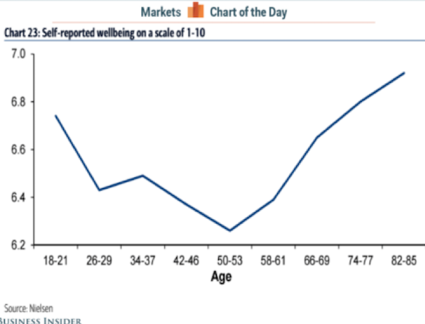 A line chart can be used to show a wide variety of things. For one, it shows change over time and trends. It can also show relationships in a data set. Try to avoid creating line charts with a lot of variables, because they will become very hard to read.
- Pie chart
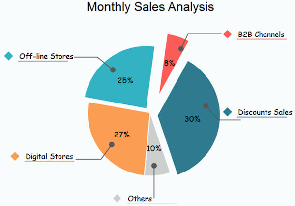
This is one of the most popular chart types of all time. They are used to show parts of a whole in percentages that add up to 100. Overall pie charts are very limited and best used for showing approximations, and for the right audience, i.e. an audience not made up of data scientists. They are good for showing data in a simple way.
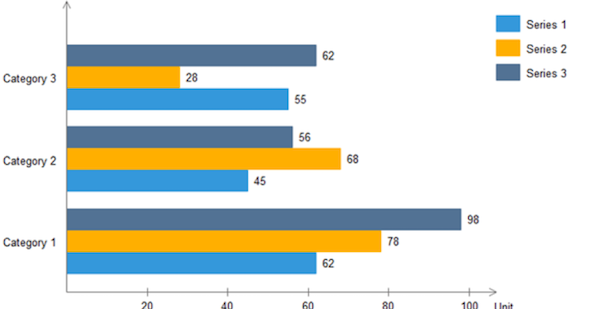
- Bar/ Column chart
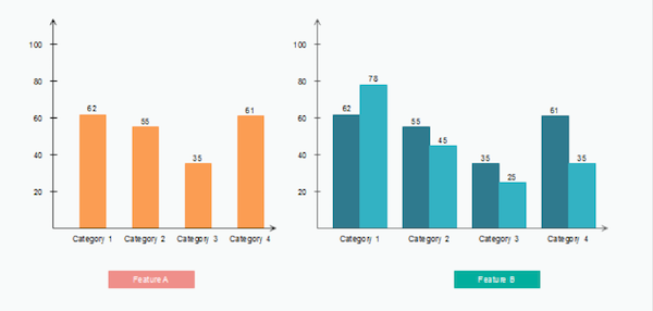
These types of charts are very similar – bars on a bar chart are horizontal, while bars on a column chart are vertical. They are used to avoid clutter when there are too many items or when one data label is too long.
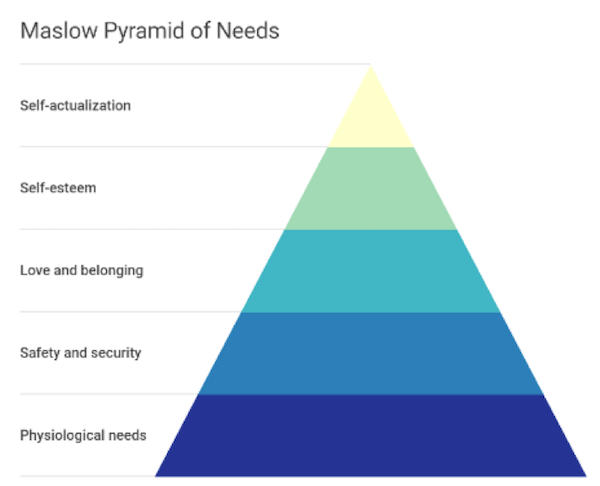
- Pyramid chart
Pyramids are often fun and they represent foundation based relationships. The pyramid is divided into horizontal parts and it can be represented top to bottom or bottom to top. It can also show an order of steps.
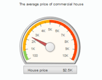
- Gauge chart
Gauge charts used needles and colors to show data as if it were being measured on a speedometer. Michelle Rose, a Data Analyst at Ox essays comments: “They are easy to understand and very good for showing one value at a time, usually side by side with another for a comparison of two variables. Their weakness is that you cannot use them to show trends and they take up a lot of space”. Consider using writing tools like Academized and Paper Fellows to create accurate comments for your gauge charts.
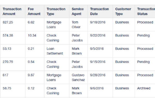
- Tables
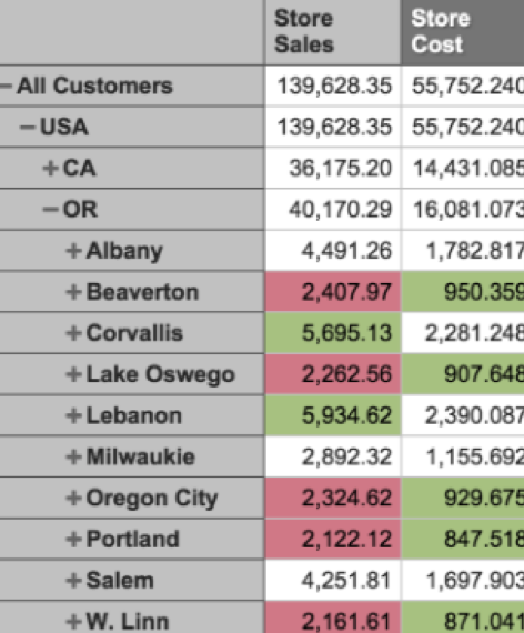
These show data in rows and columns and it’s not really a visualization as much as it is a simple representation. However, it is quite easy to compare different values in a table. Some people consider them boring and outdated. With a younger audience it’s best to stick to more modern visualizations.
- Word cloud
These are modern and simple, used to identify trends by showing frequencies or categories. They are eye-catching and tend to work best for simpler topics – nothing like budget or healthcare, for instance.

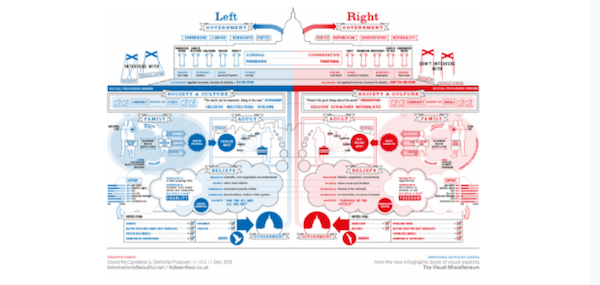
- Infographic
Infographics are extremely modern and they show information with pictures, text and motion sometimes. It’s easy to fall into a trap with these and represent too much data thus confusing your audience.
- Stacked chart
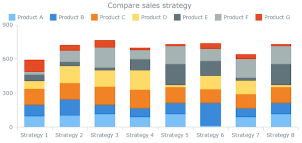
You can use stacked charts when you are comparing data to itself, basically comparing percentages of a whole. “Pie charts and stacked bar graphs are both examples of stacked charts, but best used for different purposes. Pie charts should be used to represent single part-to-whole relationships, while stacked bar charts can best be used to visualize multiple part-to-whole relationships,” writes Jacob Harris, data scientist at Australian help and Big assignments.
Final Thoughts
Choosing the right visualization for your data is an important part of the process of understanding the data and gaining some insight. Bear in mind the questions you need to answer before choosing a chart type and follow some of these tips on chart use.


